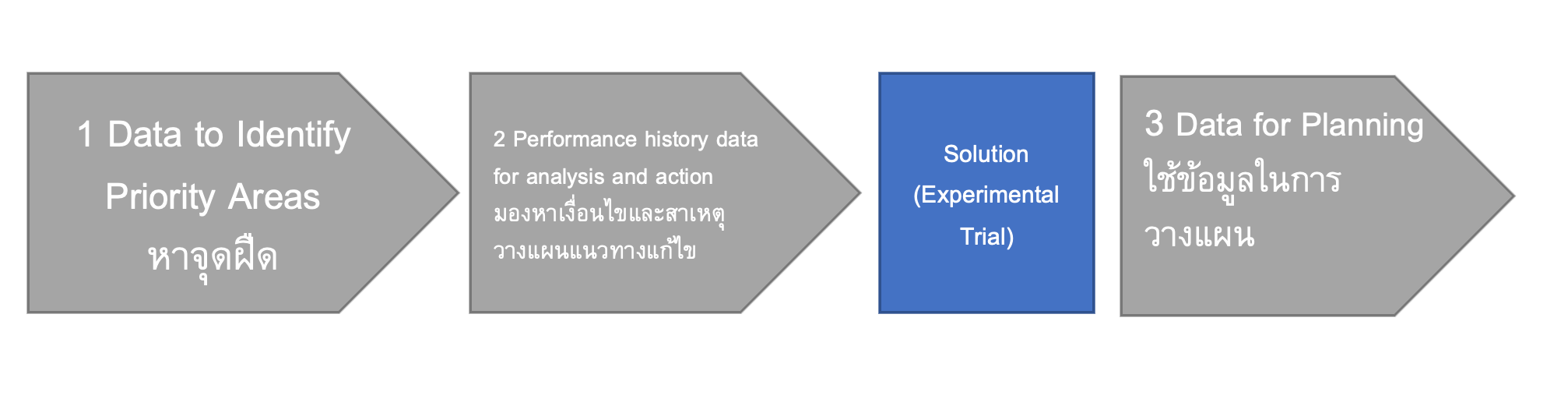
หาจุดฝืด
Data to Identify Priority Areas
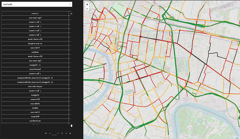
100 friction points
Top friction points around Rama IV sorted by average speed (in km/hr) to identify the most priority areas. Two different times can be selected: morning rush hours (7.00-9.00) and evening rush hours (16.00-19.00). The causes of congestion can be further explored by other visualizations.
launch the tool
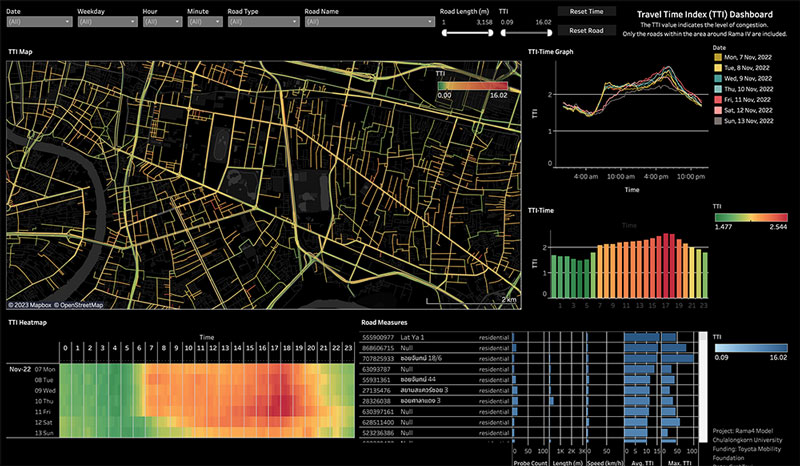
Traffic Congestion based on Travel Time Index
Travel time index (TTI) is the ratio of actual travel time to the travel time at free-flow traffic condition. It can better indicate the level of congestion than traffic speed. An overview of travel time index on the map with its trends can be explored. Users can select a prefer time and road link to further explore the detail.
launch the tool
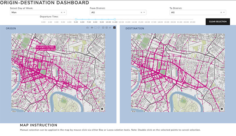
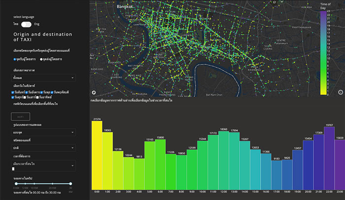
Origin And Destination (OD)
Origin and Destination (OD) can reflect travel demands. In this version of OD visualization, users can select their interesting area on both origin and destination maps and the map will displays its origin/destination based on the selected area. Instead of drawing an interesting area, district of interested can be selected from the drop-down list on top of the map. It is interesting to see where people go and where people from at a particular area, and why some particular roads are always busy.
launch the tool
Origin and Destination (OD)
Origin and Destination (OD) can reflect travel demands. In this version of OD visualization, users can select their interesting area on both origin and destination maps and the map will displays its origin/destination based on the selected area. Instead of drawing an interesting area, district of interested can be selected from the drop-down list on top of the map. It is interesting to see where people go and where people from at a particular area, and why some particular roads are always busy.
launch the tool
มองหาเงื่อนไขและสาเหตุ วางแผนแนวทางแก้ไข
Performance history data for analysis and action
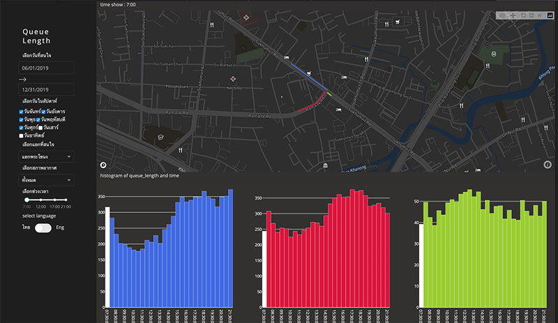
Traffic Queue Length
This visualization displays historical data of average traffic queue length derived from Grab data. The lengths of the queue display on the map so that users can comprehend the queue by comparing Point of Interests (POIs). The barcharts showing average queue length every 30 minutes depict how the queue have changed. Users can click on the barchart to show the queue length on the map. The visualization displayed trends and patterns of traffic queue so it can reflect traffic light control performance at each intersection. We can use this information to discuss with the police on the improvement of traffic light control strategy.
launch the tool
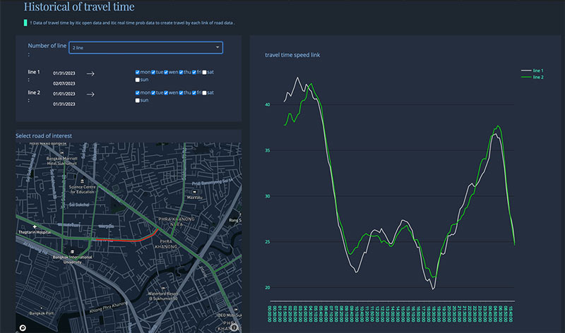
Travel Time Comparison
This visualization is created based on our requirement to compare trends of travel time between different road links.
launch the tool
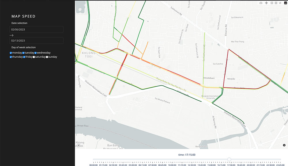
Historical speed map
This visualization shows the average speed of the selected time period. Different from popular map like Google, this map shows average speed of historical data—not the real-time. It can be used in traffic management to create a baseline for identifying congestion.
launch the tool
ใช้ข้อมูลในการวางแผน
Data for evaluation
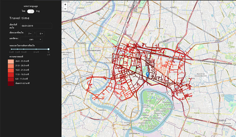
Travel Time Map
This travel time map displays how far a driver can get from a specified origin within a specified x minutes. The colors represent time. This travel time map has an advantage over previous travel time map that it is calculated from Grab data which represent real traffic situation. This map can indicate how long the commute will be for people to reach a location, accounting for traffic congestion. It can be applied to accessibility evaluation (e.g. how easy to access a hospital) and site selection (e.g. choosing the right location for a public space).
launch the tool